Adeloop Plotly 3D Examples
Creating interactive 3D visualizations with Plotly
Plotly 3D Examples for Adeloop
This guide demonstrates how to create various 3D visualizations using Plotly in Adeloop notebooks.
Overview
Plotly is a powerful visualization library that supports interactive 3D plots. In Adeloop, you can create stunning 3D visualizations that users can rotate, zoom, and interact with directly in the notebook.
Example 1: Simple 3D Scatter Plot
This example shows how to create a 3D scatter plot with colored points:
# Cell 1: Simple 3D Scatter Plot
import plotly.graph_objects as go
import numpy as np
# Generate sample data
np.random.seed(42)
n = 100
x = np.random.randn(n)
y = np.random.randn(n)
z = np.random.randn(n)
colors = np.random.randn(n)
fig = go.Figure(data=go.Scatter3d(
x=x, y=y, z=z,
mode='markers',
marker=dict(
size=8,
color=colors,
colorscale='Viridis',
showscale=True
),
text=[f'Point {i}' for i in range(n)],
hovertemplate='<b>Point %{text}</b><br>X: %{x}<br>Y: %{y}<br>Z: %{z}<extra></extra>'
))
fig.update_layout(
title='3D Scatter Plot Example',
scene=dict(
xaxis_title='X Axis',
yaxis_title='Y Axis',
zaxis_title='Z Axis'
),
width=700,
height=500
)
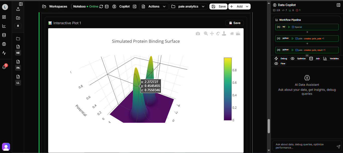
fig.show()Example 2: 3D Surface Plot
This example demonstrates how to create a 3D surface plot:
# Cell 2: 3D Surface Plot
import plotly.graph_objects as go
import numpy as np

# Generate surface data
x = np.linspace(-5, 5, 50)
y = np.linspace(-5, 5, 50)
X, Y = np.meshgrid(x, y)
Z = np.sin(np.sqrt(X**2 + Y**2))

fig = go.Figure(data=go.Surface(
    x=X, y=Y, z=Z,
    colorscale='Plasma',
    showscale=True
))

fig.update_layout(
    title='3D Surface Plot - Sine Wave',
    scene=dict(
        xaxis_title='X',
        yaxis_title='Y',
        zaxis_title='Z = sin(√(x² + y²))'
    ),
    width=700,
    height=500
)

fig.show()
Example 3: 3D Line Plot
This example shows how to create a 3D parametric line plot:
# Cell 3: 3D Line Plot
import plotly.graph_objects as go
import numpy as np

t = np.linspace(0, 4*np.pi, 100)
x = np.cos(t)
y = np.sin(t)
z = t

fig = go.Figure(data=go.Scatter3d(
    x=x, y=y, z=z,
    mode='lines+markers',
    line=dict(
        color='red',
        width=6
    ),
    marker=dict(
        size=4,
        color='blue'
    )
))

fig.update_layout(
    title='3D Helix - Parametric Line',
    scene=dict(
        xaxis_title='X = cos(t)',
        yaxis_title='Y = sin(t)',
        zaxis_title='Z = t'
    ),
    width=700,
    height=500
)

fig.show()
Example 4: 3D Bubble Chart
This example demonstrates how to create a 3D bubble chart:
# Cell 4: 3D Bubble Chart
import plotly.graph_objects as go
import numpy as np

# Sample data
data = {
    'x': [1, 2, 3, 4, 5] * 5,
    'y': [1, 1, 1, 1, 1, 2, 2, 2, 2, 2, 3, 3, 3, 3, 3, 4, 4, 4, 4, 4, 5, 5, 5, 5, 5],
    'z': np.random.randint(1, 20, 25)
}

fig = go.Figure(data=go.Scatter3d(
    x=data['x'],
    y=data['y'],
    z=[0] * len(data['x']),  # Base at z=0
    mode='markers',
    marker=dict(
        size=data['z'],
        color=data['z'],
        colorscale='Blues',
        showscale=True,
        sizemode='diameter',
        sizeref=2.*max(data['z'])/(40.**2),
        sizemin=4
    ),
    text=[f'Value: {z}' for z in data['z']],
    hovertemplate='X: %{x}<br>Y: %{y}<br>Value: %{text}<extra></extra>'
))

fig.update_layout(
    title='3D Bubble Chart',
    scene=dict(
        xaxis_title='X Category',
        yaxis_title='Y Category',
        zaxis_title='Height'
    ),
    width=700,
    height=500
)

fig.show()
Example 5: Multiple 3D Objects
This example shows how to combine multiple 3D objects in one plot:
# Cell 5: Multiple 3D Objects
import plotly.graph_objects as go
import numpy as np

# Sphere
u = np.linspace(0, 2 * np.pi, 50)
v = np.linspace(0, np.pi, 50)
x_sphere = np.outer(np.cos(u), np.sin(v))
y_sphere = np.outer(np.sin(u), np.sin(v))
z_sphere = np.outer(np.ones(np.size(u)), np.cos(v))

# Cone
theta = np.linspace(0, 2*np.pi, 30)
r = np.linspace(0, 1, 20)
R, T = np.meshgrid(r, theta)
x_cone = R * np.cos(T) + 3
y_cone = R * np.sin(T)
z_cone = R + 1

fig = go.Figure()

# Add sphere
fig.add_trace(go.Surface(
    x=x_sphere, y=y_sphere, z=z_sphere,
    colorscale='Blues',
    name='Sphere',
    showscale=False
))

# Add cone
fig.add_trace(go.Surface(
    x=x_cone, y=y_cone, z=z_cone,
    colorscale='Reds',
    name='Cone',
    showscale=False
))

fig.update_layout(
    title='Multiple 3D Objects',
    scene=dict(
        xaxis_title='X',
        yaxis_title='Y',
        zaxis_title='Z'
    ),
    width=700,
    height=500
)

fig.show()
Running All Examples
To run all examples at once:
# Cell 6: Run All Examples
def run_all_examples():
    """Run all 3D plotting examples"""
    print("🎯 Running Plotly 3D Examples...")

    # You would call each function here
    # create_3d_scatter()
    # create_3d_surface()
    # create_3d_line()
    # create_3d_bar()
    # create_multiple_3d()

    print("✅ All examples completed!")

# Run the function
run_all_examples()
Key Features of Plotly 3D Visualizations
- Interactivity: Users can rotate, zoom, and pan the 3D plots
- Customization: Extensive options for colors, markers, and layouts
- Hover Information: Detailed information on hover
- Multiple Plot Types: Support for scatter, surface, line, and other 3D plot types
Best Practices
- Performance: For large datasets, consider using
opacityto improve performance - Color Scales: Use appropriate color scales to represent your data effectively
- Axis Labels: Always label your axes for clarity
- Responsive Design: Set appropriate width and height for your plots
These Plotly 3D examples demonstrate the powerful visualization capabilities available in Adeloop notebooks, allowing you to create interactive and engaging 3D visualizations for your data analysis projects.