Adeloop Pipeline Workflow Examples
Orchestrating complex data processing workflows with variable sharing
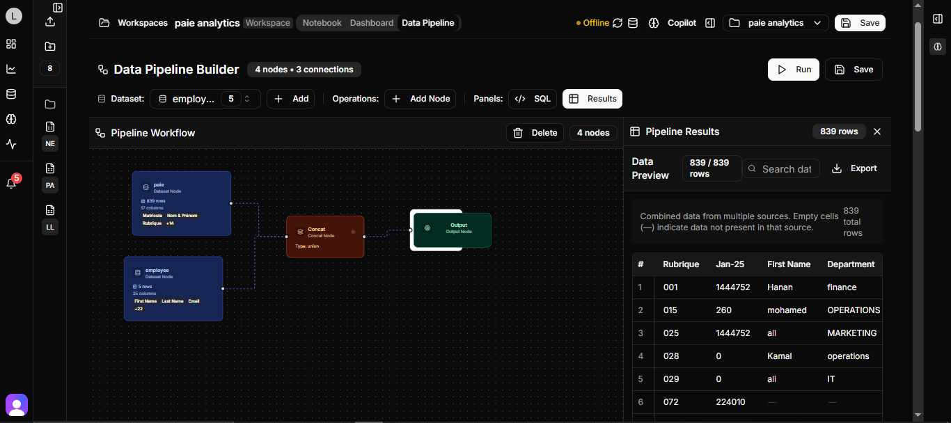
Pipeline Workflow Examples for Adeloop
This guide demonstrates how to create and orchestrate complex data processing workflows in Adeloop notebooks, with variable sharing between cells.
Overview
Pipeline workflows are essential for data science projects where you need to process data in multiple steps, with each step building on the results of the previous one. In Adeloop, you can create sophisticated workflows where variables created in one cell are automatically available in subsequent cells.
Example Workflow: HR Analytics Dashboard
This example demonstrates a complete HR analytics workflow with multiple cells that share variables:
Cell 1: Data Loading and Preprocessing
# Cell 1: Data Loading and Preprocessing
# This cell loads data and creates variables that will be used in subsequent cells

import pandas as pd
import numpy as np
import matplotlib.pyplot as plt
import cv2
import mediapipe as mp

# Load and prepare employee data
employee_data = {
    'employee_id': range(1, 101),
    'name': [f'Employee_{i}' for i in range(1, 101)],
    'department': np.random.choice(['Engineering', 'Sales', 'Marketing', 'HR'], 100),
    'salary': np.random.normal(75000, 15000, 100),
    'age': np.random.randint(22, 65, 100),
    'years_experience': np.random.randint(0, 20, 100),
    'performance_score': np.random.uniform(1, 5, 100)
}

# Create main DataFrame
df_employees = pd.DataFrame(employee_data)

# Create derived variables for next cells
high_performers = df_employees[df_employees['performance_score'] > 4.0]
dept_summary = df_employees.groupby('department').agg({
    'salary': ['mean', 'count'],
    'performance_score': 'mean'
}).round(2)

# Variables that will be available in next cells:
# - df_employees: Main employee DataFrame
# - high_performers: Filtered high-performing employees
# - dept_summary: Department-wise summary statistics

result = df_employees.head()
Cell 2: Statistical Analysis
# Cell 2: Statistical Analysis
# This cell uses variables from Cell 1 to perform analysis

# Use the df_employees variable from previous cell
correlation_matrix = df_employees[['salary', 'age', 'years_experience', 'performance_score']].corr()

# Create new variables for visualization
salary_by_dept = df_employees.groupby('department')['salary'].mean().sort_values(ascending=False)
age_groups = pd.cut(df_employees['age'], bins=[20, 30, 40, 50, 65], labels=['20-30', '31-40', '41-50', '51-65'])
df_employees['age_group'] = age_groups

# Statistical insights
avg_salary = df_employees['salary'].mean()
top_department = salary_by_dept.index[0]
high_performer_count = len(high_performers)

print(f"Average Salary: ${avg_salary:,.2f}")
print(f"Top Paying Department: {top_department}")
print(f"High Performers Count: {high_performer_count}")

result = correlation_matrix
Cell 3: Data Visualization
# Cell 3: Data Visualization
# This cell creates visualizations using variables from previous cells

# Create a comprehensive dashboard plot
fig, ((ax1, ax2), (ax3, ax4)) = plt.subplots(2, 2, figsize=(15, 12))

# Plot 1: Salary by Department (using salary_by_dept from Cell 2)
salary_by_dept.plot(kind='bar', ax=ax1, color='skyblue')
ax1.set_title('Average Salary by Department')
ax1.set_ylabel('Salary ($)')
ax1.tick_params(axis='x', rotation=45)

# Plot 2: Performance Score Distribution (using df_employees from Cell 1)
ax2.hist(df_employees['performance_score'], bins=20, color='lightgreen', alpha=0.7)
ax2.set_title('Performance Score Distribution')
ax2.set_xlabel('Performance Score')
ax2.set_ylabel('Frequency')

# Plot 3: Age vs Salary Scatter (using df_employees from Cell 1)
scatter = ax3.scatter(df_employees['age'], df_employees['salary'],
                     c=df_employees['performance_score'], cmap='viridis', alpha=0.6)
ax3.set_title('Age vs Salary (colored by Performance)')
ax3.set_xlabel('Age')
ax3.set_ylabel('Salary ($)')
plt.colorbar(scatter, ax=ax3, label='Performance Score')

# Plot 4: High Performers by Department (using high_performers from Cell 1)
high_perf_by_dept = high_performers.groupby('department').size()
ax4.pie(high_perf_by_dept.values, labels=high_perf_by_dept.index, autopct='%1.1f%%')
ax4.set_title('High Performers Distribution by Department')

plt.tight_layout()
result = get_plot()
Cell 4: Computer Vision Analysis
# Cell 4: Computer Vision Analysis
# This cell demonstrates computer vision capabilities with employee photos

# Create a sample employee photo analysis
def analyze_employee_photo():
    # Create a sample image representing an employee photo
    img = np.ones((400, 300, 3), dtype=np.uint8) * 255

    # Add some visual elements
    cv2.rectangle(img, (50, 50), (250, 350), (200, 200, 200), -1)
    cv2.putText(img, "Employee Photo", (70, 100), cv2.FONT_HERSHEY_SIMPLEX, 0.8, (0, 0, 0), 2)
    cv2.putText(img, "Face Detection Demo", (60, 150), cv2.FONT_HERSHEY_SIMPLEX, 0.6, (100, 100, 100), 1)

    # Initialize MediaPipe Face Detection
    mp_face_detection = mp.solutions.face_detection
    mp_draw = mp.solutions.drawing_utils

    with mp_face_detection.FaceDetection(min_detection_confidence=0.5) as face_detection:
        # Convert BGR to RGB
        rgb_img = cv2.cvtColor(img, cv2.COLOR_BGR2RGB)
        results = face_detection.process(rgb_img)

        # Draw face detections if any
        if results.detections:
            for detection in results.detections:
                mp_draw.draw_detection(img, detection)

    return img

# Analyze photos for employees in the high_performers group
analyzed_photo = analyze_employee_photo()

# Display the result
plt.figure(figsize=(10, 8))
plt.imshow(cv2.cvtColor(analyzed_photo, cv2.COLOR_BGR2RGB))
plt.title(f'Computer Vision Analysis for {len(high_performers)} High Performers')
plt.axis('off')

# Add text overlay with statistics from previous cells
plt.figtext(0.02, 0.02, f'High Performers: {len(high_performers)} | Avg Salary: ${avg_salary:,.0f}',
           fontsize=10, bbox=dict(boxstyle="round,pad=0.3", facecolor="white", alpha=0.8))

result = get_plot()
Cell 5: Interactive Streamlit Dashboard
# Cell 5: Interactive Streamlit Dashboard
# This cell creates an interactive dashboard using all previous variables

streamlit_app_code = f'''
import streamlit as st
import pandas as pd
import plotly.express as px
import plotly.graph_objects as go

st.title("🏢 HR Analytics Dashboard")
st.write("Interactive analysis of employee data")

# Use data from previous cells (these would be passed via variable context)
# df_employees, high_performers, dept_summary, salary_by_dept, etc.

# Sidebar filters
st.sidebar.header("Filters")
selected_dept = st.sidebar.multiselect(
    "Select Departments",
    options=df_employees['department'].unique(),
    default=df_employees['department'].unique()
)

age_range = st.sidebar.slider(
    "Age Range",
    min_value=int(df_employees['age'].min()),
    max_value=int(df_employees['age'].max()),
    value=(int(df_employees['age'].min()), int(df_employees['age'].max()))
)

# Filter data
filtered_df = df_employees[
    (df_employees['department'].isin(selected_dept)) &
    (df_employees['age'].between(age_range[0], age_range[1]))
]

# Metrics
col1, col2, col3, col4 = st.columns(4)
with col1:
    st.metric("Total Employees", len(filtered_df))
with col2:
    st.metric("Avg Salary", f"${filtered_df['salary'].mean():,.0f}")
with col3:
    st.metric("High Performers", len(filtered_df[filtered_df['performance_score'] > 4.0]))
with col4:
    st.metric("Avg Performance", f"{filtered_df['performance_score'].mean():.2f}")

# Charts
col1, col2 = st.columns(2)

with col1:
    fig = px.box(filtered_df, x='department', y='salary', title='Salary Distribution by Department')
    st.plotly_chart(fig, use_container_width=True)

with col2:
    fig = px.scatter(filtered_df, x='age', y='salary', color='performance_score',
                    title='Age vs Salary (colored by Performance)')
    st.plotly_chart(fig, use_container_width=True)

# Data table
st.subheader("Employee Data")
st.dataframe(filtered_df)

# Computer Vision Section
st.subheader("🎯 Computer Vision Analysis")
st.write("Employee photo analysis results from previous cell:")
st.write(f"Analyzed photos for {len(high_performers)} high-performing employees")
'''

print("Streamlit Dashboard Code Generated!")
print("Variables available from previous cells:")
print(f"- df_employees: {df_employees.shape}")
print(f"- high_performers: {high_performers.shape}")
print(f"- dept_summary: {dept_summary.shape}")
print(f"- salary_by_dept: {len(salary_by_dept)} departments")
print(f"- avg_salary: ${avg_salary:,.2f}")
print(f"- top_department: {top_department}")

result = "Interactive Streamlit dashboard code generated with variable context"
Cell 6: Final Report Generation
# Cell 6: Final Report Generation
# This cell creates a final report using all variables from previous cells

# Generate comprehensive report
report = {
    'total_employees': len(df_employees),
    'departments': df_employees['department'].nunique(),
    'avg_salary': avg_salary,
    'salary_range': {
        'min': df_employees['salary'].min(),
        'max': df_employees['salary'].max()
    },
    'high_performers': {
        'count': len(high_performers),
        'percentage': (len(high_performers) / len(df_employees)) * 100
    },
    'top_department': {
        'name': top_department,
        'avg_salary': salary_by_dept.iloc[0]
    },
    'age_demographics': {
        'avg_age': df_employees['age'].mean(),
        'age_range': {
            'min': df_employees['age'].min(),
            'max': df_employees['age'].max()
        }
    }
}

print("=== HR ANALYTICS FINAL REPORT ===")
print(f"Total Employees Analyzed: {report['total_employees']}")
print(f"Departments: {report['departments']}")
print(f"Average Salary: ${report['avg_salary']:,.2f}")
print(f"Salary Range: ${report['salary_range']['min']:,.0f} - ${report['salary_range']['max']:,.0f}")
print(f"High Performers: {report['high_performers']['count']} ({report['high_performers']['percentage']:.1f}%)")
print(f"Top Department: {report['top_department']['name']} (${report['top_department']['avg_salary']:,.0f})")
print(f"Average Age: {report['age_demographics']['avg_age']:.1f} years")

result = report
Key Features of Pipeline Workflows
- Variable Sharing: Variables created in one cell are automatically available in subsequent cells
- Progressive Analysis: Each cell builds on the results of previous cells
- Modular Design: Complex workflows can be broken down into manageable steps
- Interactive Results: Each cell can produce visualizations, reports, or other outputs
Best Practices
- Document Your Variables: Clearly document which variables are created in each cell
- Error Handling: Include error handling in your cells to make workflows robust
- Clear Naming: Use descriptive variable names to make your workflow easy to understand
- Progressive Complexity: Start with simple steps and gradually build complexity
These pipeline workflow examples demonstrate how to create sophisticated data analysis workflows in Adeloop, where each step builds on the results of the previous one.