Rich Output Support
Displaying DataFrames, plots, and complex data structures
Rich output support allows displaying various data types in an enhanced visual format rather than plain text, similar to Jupyter notebooks.
Overview
Rich output support in Adeloop allows displaying various data types in enhanced visual formats rather than plain text. This includes DataFrames, plots, images, and other complex data structures.
Supported Output Types
DataFrames
When you assign a pandas DataFrame to the result variable, it will be automatically displayed in a tabular format with sorting and filtering capabilities.
import pandas as pd

# Create sample data
data = {
    'Name': ['Alice', 'Bob', 'Charlie', 'Diana', 'Eve'],
    'Age': [25, 30, 35, 28, 32],
    'Department': ['Engineering', 'Marketing', 'Sales', 'HR', 'Finance'],
    'Salary': [70000, 65000, 60000, 55000, 75000]
}
df = pd.DataFrame(data)

# This will be displayed as an interactive table
result = df
The interactive table allows you to:
- Sort columns by clicking on headers
- Filter data using the filter controls
- Search within the table
- Export data to CSV
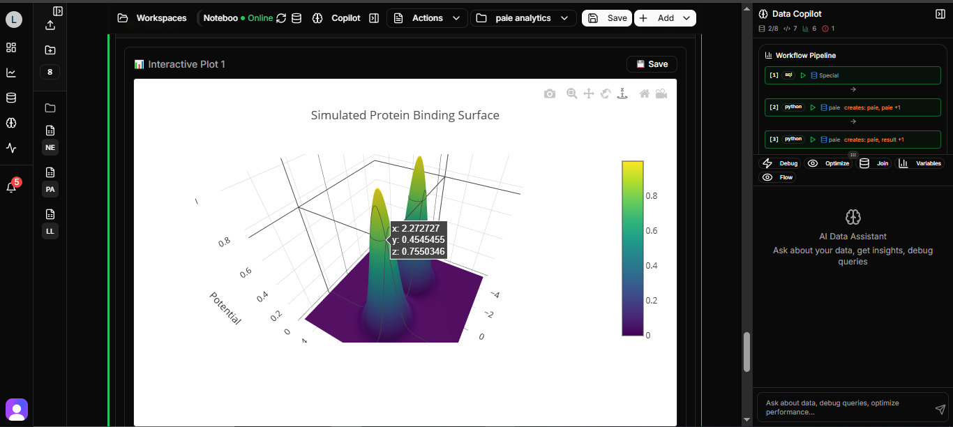
Plots and Visualizations
Matplotlib, Plotly, and other plotting libraries are supported with inline rendering:
import matplotlib.pyplot as plt
import numpy as np

# Create sample data
x = np.linspace(0, 10, 100)
y1 = np.sin(x)
y2 = np.cos(x)

# Create plot
plt.figure(figsize=(12, 6))
plt.plot(x, y1, label='sin(x)')
plt.plot(x, y2, label='cos(x)')
plt.title('Trigonometric Functions')
plt.xlabel('X values')
plt.ylabel('Y values')
plt.legend()
plt.grid(True)
plt.show()
Images
Image files can be displayed inline:
from PIL import Image
import matplotlib.pyplot as plt

# Load and display an image
img = Image.open('sample-image.png')
plt.figure(figsize=(8, 6))
plt.imshow(img)
plt.axis('off')  # Hide axes
plt.title('Sample Image')
plt.show()
How It Works
- When code is executed, the kernel checks if a variable named
resultexists in the namespace - If the
resultvariable contains a supported data type (like a pandas DataFrame), it's formatted for rich display - The formatted data is sent through the WebSocket connection to the frontend
- The frontend displays the data in the appropriate visualization format
Technical Implementation
The rich output support is implemented across multiple components:
- Backend: The kernel service identifies and formats rich output data
- WebSocket API: Transmits formatted data to the frontend
- Frontend: Processes and displays the rich output in the appropriate format
Usage Tips
- Assign your final output to the
resultvariable to trigger rich display - For DataFrames, they will automatically appear in the table tab
- Make sure to import required libraries (like pandas) before using them
- Use
plt.show()to display matplotlib plots
Example Notebook
Try this comprehensive example to see rich output in action:
import pandas as pd
import matplotlib.pyplot as plt
import numpy as np

# Create a comprehensive dataset
np.random.seed(42)
dates = pd.date_range('2023-01-01', periods=100, freq='D')
data = {
    'Date': dates,
    'Sales': np.random.randint(1000, 5000, 100),
    'Expenses': np.random.randint(500, 3000, 100),
    'Profit': None  # Will calculate this
}
df = pd.DataFrame(data)

# Calculate profit
df['Profit'] = df['Sales'] - df['Expenses']

# Display as rich output table
print("Financial Data:")
result = df.head(10)  # Show first 10 rows

# Create visualizations
fig, axes = plt.subplots(2, 2, figsize=(15, 10))

# Sales over time
axes[0, 0].plot(df['Date'], df['Sales'], color='blue')
axes[0, 0].set_title('Sales Over Time')
axes[0, 0].set_xlabel('Date')
axes[0, 0].set_ylabel('Sales')

# Expenses over time
axes[0, 1].plot(df['Date'], df['Expenses'], color='red')
axes[0, 1].set_title('Expenses Over Time')
axes[0, 1].set_xlabel('Date')
axes[0, 1].set_ylabel('Expenses')

# Profit over time
axes[1, 0].plot(df['Date'], df['Profit'], color='green')
axes[1, 0].set_title('Profit Over Time')
axes[1, 0].set_xlabel('Date')
axes[1, 0].set_ylabel('Profit')

# Histogram of sales
axes[1, 1].hist(df['Sales'], bins=20, color='purple', alpha=0.7)
axes[1, 1].set_title('Sales Distribution')
axes[1, 1].set_xlabel('Sales')
axes[1, 1].set_ylabel('Frequency')

plt.tight_layout()
plt.show()

# Summary statistics
summary = df[['Sales', 'Expenses', 'Profit']].describe()
print("\nSummary Statistics:")
result = summary
This example demonstrates:
- Rich output for DataFrames with interactive tables
- Multiple matplotlib plots displayed inline
- Proper use of the
resultvariable for different outputs